Create a brand identity for one of Ottawa’s premier training facilities that speaks to its high-performance side, yet still feels approachable and community oriented.
Client: Capital Strength
Project Scope: Brand Strategy, Art Direction, Copywriting
Leading the Pack
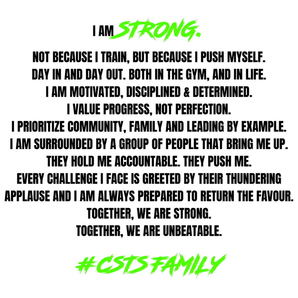
For a personalized and powerful look, we chose bright green as a primary colour and created a custom font to help highlight keywords in copy and convey the energy and enthusiasm of the organization.
#1CD400
Premium & Personalized
Capital Strength needed a visual identity that reflected its unique offering in the nation’s capital. So, we created a clean and simple logo that reflected it’s premium, personalized approach to training and added subtle detailing to channel the intensity and attitude that radiates the 5,647 sq ft facility.
United in Fitness
Capital Strength is more than a gym. It’s a community of like-minded athletes, passionate about their health, pushing their limits, and unlocking their full potential. And to help them show their pride, we created a clothing line that went well beyond branded apparel. It served as a stylish badge of honour.